
Case Study—FinTech
FNEX—Brand Refresh
A FinTech brand refresh: new identity, icon set, and UI design for the Dark Pool web app.
- Brand Identity
- Icon Design
- UI Design
- Website Design
The Challenge
Most of our work lives in the AEC world—but every so often, a project outside the industry lets us stretch. FNEX is one of those occasional ventures beyond AEC: a FinTech firm that needed its brand and web presence brought up to the standard of its platform.
We worked with FNEX to refresh their FinTech brand and web presence. The brand had to communicate credibility to a financial audience—investors and institutions who judge a platform by its polish—and the product interface needed the same attention as the marketing.
The Approach
A refresh is a different discipline than a rebrand. FNEX didn’t need a new name or a new story; they needed the existing brand sharpened and made consistent everywhere it appeared—from the logo, to the icons inside the product, to the marketing site that makes the first impression.
So we treated identity, iconography, product UI, and website as one system rather than four projects. FinTech users move between the marketing site and the app constantly; the brand should never break along the way.
The Work
- Brand identity—a refreshed identity that kept FNEX recognizable while sharpening the overall look.
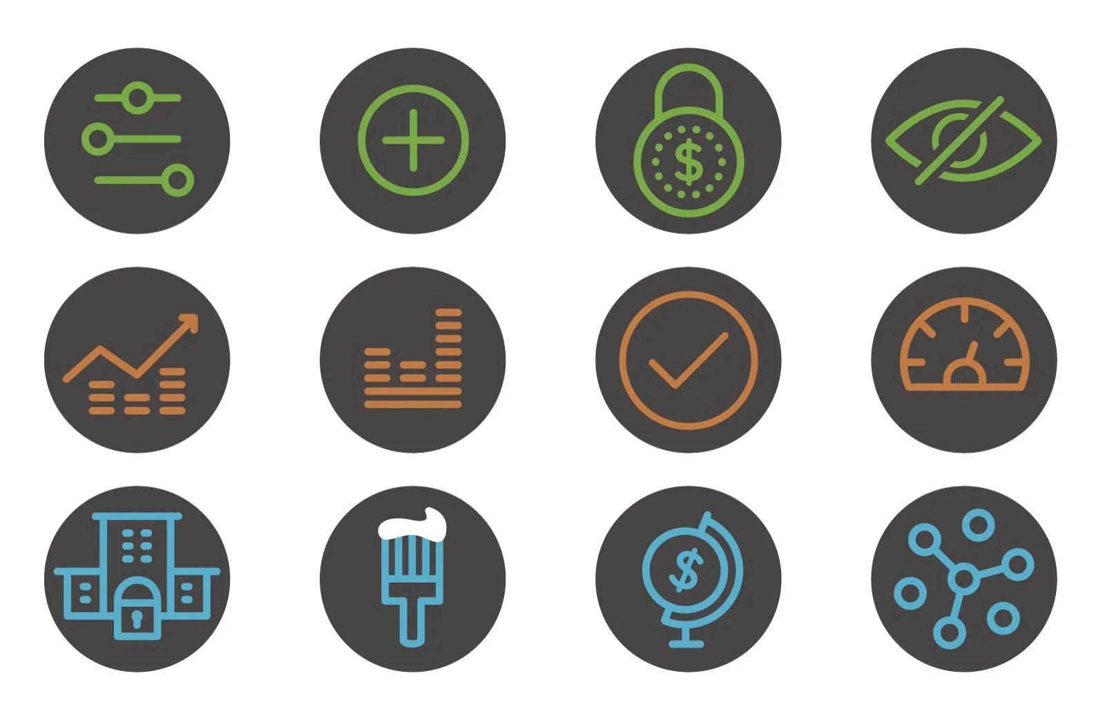
- New icon set—a custom icon system built to carry the refreshed brand into the product itself.
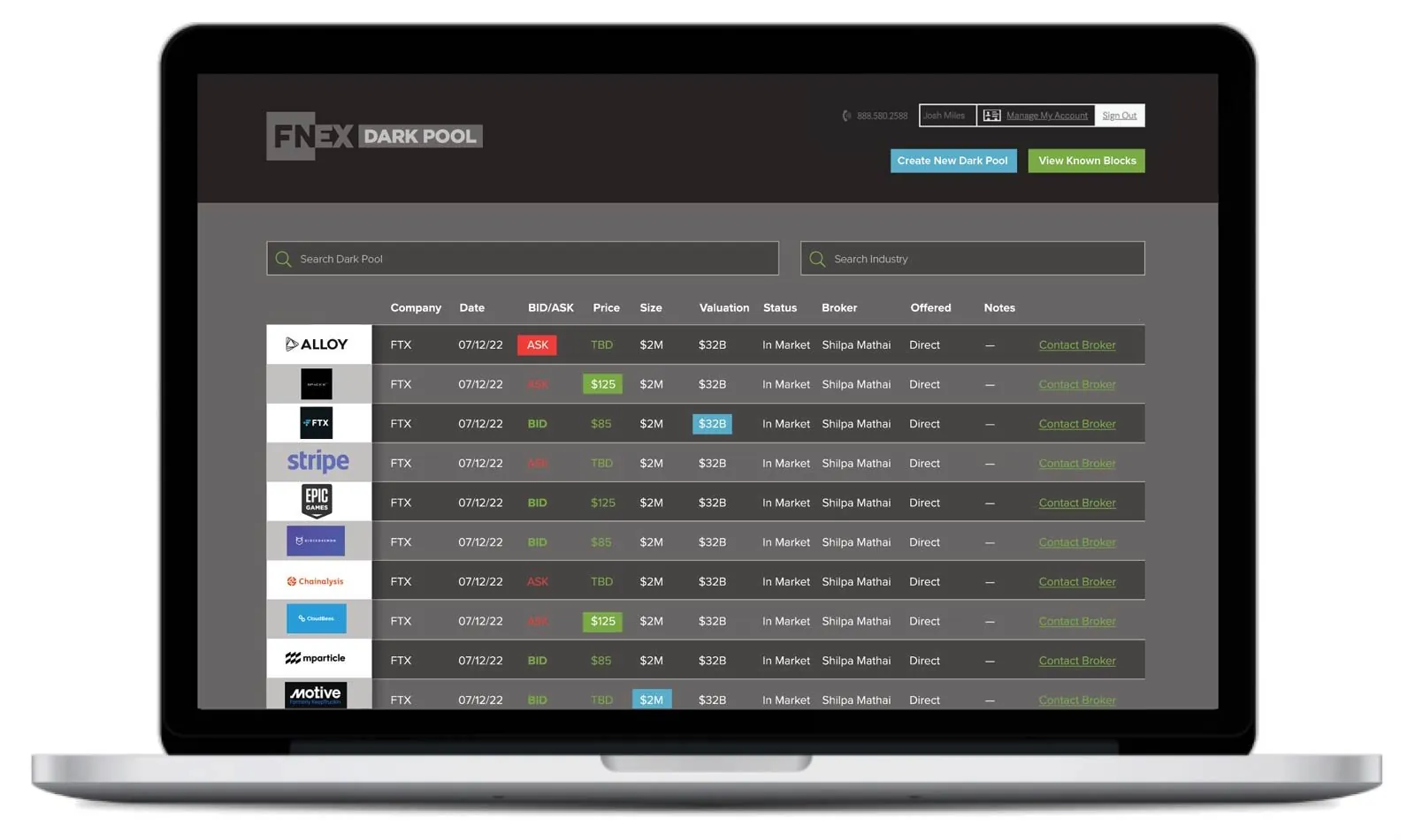
- Dark Pool UI design—we worked on the FNEX web app design, updating the look and feel of the Dark Pool application to improve the overall user experience. Financial software has to be dense with information yet effortless to scan; the UI update aimed squarely at that balance.
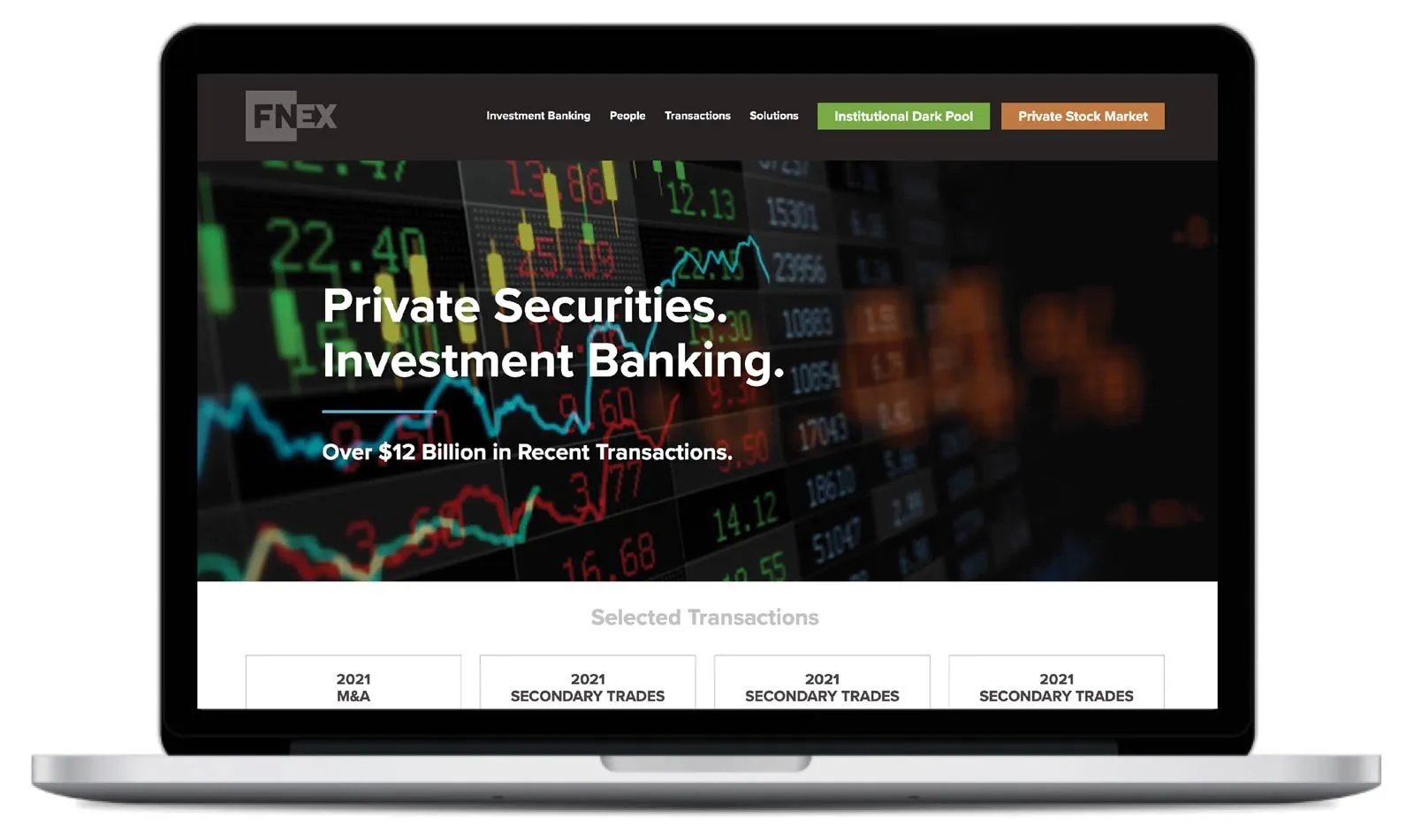
- Redesigned website—a new marketing site that presents the refreshed brand and makes the case for the platform.
The Results
FNEX came out of the engagement with a single, consistent brand running from first website visit through daily use of the web app—refreshed identity, purpose-built icons, a cleaner UI, and a redesigned site to front it all.
And for us, the project proved a point we like making: the discipline behind our AEC work—strategy first, systems over one-offs—travels just fine into other industries. Whether the client builds tunnels or trading platforms, the fundamentals don’t change: understand the audience, sharpen the message, and make every touchpoint carry the same brand.
The work
Ready to rebrand?
If you’re doing great work but losing projects and talent to firms that just look bigger, let’s talk about what a bold brand could do for you.
Schedule a Discovery Call See the Work
Not ready for a call? Start with the DIY Brand Audit →